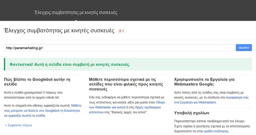
For most of the web’s history, search engines built their understanding of a website by looking at the desktop version of each page. That assumption made sense when people sat at a keyboard to browse. It stopped making sense the moment the majority of searches began arriving from phones held in waiting rooms, on trains, and in the few spare seconds people grab between tasks. Google responded by inverting its own default: instead of crawling the desktop page and treating the phone experience as an afterthought, it now crawls, renders, and indexes the version of your site that a smartphone user would receive. This is mobile-first indexing, and it has quietly become the foundation on which every modern site’s visibility rests.
The phrase can mislead newcomers, because “mobile-first” does not mean “mobile only,” and it does not mean your desktop visitors are ignored. It describes which copy of your content Google treats as the source of truth when deciding what your page is about and how it should rank. If your mobile experience is thinner, slower, or structurally different from your desktop experience, Google’s view of your site is shaped by that weaker version. Understanding this distinction is the difference between a site that quietly loses ground over months and one that holds its position as search behavior keeps tilting toward small screens. This article explains how the system works, where sites lose visibility without realizing it, and what a practical website-promotion strategy looks like when the mobile page is the one that counts.
The news portal Gossiptime.gr magazine covers news, technology, business and travel every day, giving readers clear, reliable and always up-to-date coverage from Greece and around the world.
What Mobile-First Indexing Actually Means
Indexing is the process by which a search engine discovers a page, reads its content, interprets its structure, and stores a representation of it so that it can be retrieved later for relevant queries. Historically that representation was built from the desktop rendering. Under mobile-first indexing, the smartphone crawler fetches your page, runs the same code a phone browser would run, and the resulting page becomes the basis for indexing and ranking. The desktop version still exists and still serves desktop visitors, but it is no longer the primary reference Google consults when it decides what you offer.
It is worth being precise about the boundary here. Mobile-first indexing changes which version is indexed. It does not, on its own, change the ranking factors that apply once a page is in the index. Relevance, content quality, links, and user signals still matter the way they always did. What changes is the input: those factors are now assessed against your mobile page. A brilliant desktop article that collapses into a stub on mobile will be judged as a stub. The mobile rendering is the evidence, and everything downstream is built on it.
Read more: Athens Escorts: Τα 25 Κορυφαία Γραφεία Συνοδών στην Αθήνα
Why Google Made the Switch
The motivation was not ideological; it was a reflection of measured behavior. Phone-based search overtook desktop search years ago and never looked back. When the dominant way people reach your content is through a small touchscreen on an often-imperfect connection, indexing the desktop page produces a systematic mismatch. Google would rank a page based on rich desktop content, then deliver a phone user to a page that was slower, harder to read, or missing entire sections. That gap between what was ranked and what was experienced eroded the quality of results.
By making the mobile page the canonical version, Google aligned the thing it measures with the thing the searcher actually receives. The change also created a powerful incentive. Site owners who had treated their mobile experience as a stripped-down courtesy were now told, in effect, that the mobile experience is the experience. Promotion efforts that ignore this alignment end up optimizing a version of the site that Google barely consults.
How the Smartphone Crawler Reads Your Pages
Google’s crawler visits your site identifying itself as a smartphone user agent. It requests your pages the way a mobile device would, follows the links it finds, and renders the result using a modern browser engine. Rendering is the step that trips up many sites. The crawler does not simply read raw HTML and stop; it executes the page, including scripts that load content after the initial response. If your main content, your internal links, or your structured data only appear after an interaction the crawler cannot perform, that material may never enter the rendered page the crawler sees.
Rendering and the JavaScript Question
Many modern sites build large portions of the page in the browser using JavaScript. This can work well for indexing, but it introduces a dependency: the content exists only if the script runs successfully and finishes in a reasonable time. Heavy reliance on client-side rendering raises the risk that something important is missing when the crawler captures the page. The safest posture is to ensure that your primary content and navigation are present in a form the crawler can reliably obtain, rather than assuming every script will execute flawlessly on every fetch.
Crawl Budget and Efficiency
Every site has a practical limit on how much crawling attention it receives. Slow responses, redirect chains, and wasteful duplicate URLs all consume that attention without producing value. A mobile site that responds quickly and serves clean, canonical URLs lets the crawler spend its time discovering and refreshing the pages that matter. Promotion is not only about adding content; it is also about removing the friction that keeps your best content from being crawled in the first place.
Content Parity: The Single Most Important Principle
If you remember one idea from this article, make it parity. Content parity means the mobile version of a page contains the same primary content as the desktop version: the same body text, the same headings, the same images and their descriptions, the same structured data, and the same internal links. When parity holds, the switch to mobile-first indexing is invisible to your rankings, because the page Google indexes carries everything it carried before. When parity breaks, you lose exactly the material you removed from mobile.
Parity problems usually arise from good intentions. A team decides that mobile users do not need a lengthy explanatory section, so they hide it on small screens. They drop a sidebar full of contextual links to simplify the layout. They serve smaller images without descriptive alternative text. Each decision feels like a sensible tidy-up, and each quietly subtracts signals that Google uses to understand and connect the page. The cumulative effect is a mobile site that says less than the desktop site once did, and therefore ranks for less.
- Keep the full body text on mobile; do not truncate articles or product descriptions for small screens.
- Preserve all headings in the same hierarchy so the page’s structure reads the same to the crawler.
- Include the same images and keep descriptive alternative text on every one of them.
- Replicate structured data on the mobile version exactly as it appears on desktop.
- Retain internal links, including contextual links inside the body, so crawl paths and topical connections survive.
- Match metadata such as titles and descriptions across both versions of every page.
The Hidden Traps That Cost Sites Their Rankings
Some of the most damaging parity failures are invisible to a casual glance because the desktop site looks healthy. The trouble lives in what mobile users, and therefore the crawler, never see.
Accordions, Tabs, and Hidden Content
Collapsing content behind tabs or accordions on mobile is acceptable as long as the content is present in the rendered page and merely visually hidden until tapped. The danger appears when the content is not loaded at all until the user interacts, because the crawler does not tap, swipe, or scroll the way a human does. Content that requires an action to load can be content the crawler never captures. Favor patterns that keep the material in the page from the start, hiding it with styling rather than withholding it until an event fires.
Read more: Ο Μπαπέ κατηγορείται στη Σουηδία για βιασμό
Lazy Loading Done Wrong
Loading images and sections as the user scrolls is excellent for performance, but it must be implemented so that the crawler can still obtain the content. If your lazy loading depends on scroll events that never occur during an automated fetch, the deferred content can vanish from the crawler’s view. Use loading approaches that allow the crawler to retrieve the deferred resources, and verify that what loads for a scrolling human also reaches an automated fetch.
Stripped Navigation and Lost Links
Mobile menus are often condensed into a single icon, which is fine for people but risky for crawling if the underlying links are not present in the page. Internal links are how authority and context flow through a site and how deep pages get discovered. When the mobile menu hides links behind interactions the crawler cannot complete, whole sections of the site can become harder to reach. Confirm that your important internal links exist in the rendered mobile page, not only in a script that runs after a tap.
Performance and Core Web Vitals on Mobile
Because the mobile page is now the indexed page, the experience that page delivers carries weight. Google measures aspects of real-world experience: how quickly the largest piece of content appears, how stable the layout is as it loads, and how responsive the page is to the first interaction. These measurements are taken in the context that matters most, which is a phone, often on a constrained connection and a modest processor. A page that feels instant on a developer’s fast laptop can feel sluggish on a mid-range phone, and the mobile reality is what shapes the experience signals.
Performance work for mobile-first indexing is rarely glamorous, but it compounds. Compressing and correctly sizing images prevents the page from shipping more data than a phone needs. Reserving space for elements that load later stops the page from jumping around as it assembles. Trimming unnecessary scripts shortens the time before the page becomes usable. None of these tasks individually feels like a ranking strategy, yet together they determine whether the version of your site Google indexes is a pleasure or a chore to use. In website promotion, speed is not a luxury feature; it is the medium through which all your content is delivered.
Read more: Στα γραφεία της ΕΥΔΑΠ την Τετάρτη
Responsive Design Versus Separate Mobile URLs
There are two broad ways to serve a mobile experience, and they carry very different risk profiles under mobile-first indexing. A responsive design serves a single set of URLs and a single body of HTML that adapts its layout to the screen using styling rules. Because there is only one version of the content, parity is essentially automatic: the crawler and the desktop user receive the same material, simply arranged differently. This is the configuration Google recommends, and it is the safest foundation for promotion because it removes an entire category of mismatch.
The alternative is a separate mobile site, often served from a distinct subdomain, with its own URLs and its own content. This arrangement was common in an earlier era and still exists across many established sites. It is workable, but it demands constant vigilance, because every piece of content, every link, and every structured-data block must be kept identical across two codebases. The moment the mobile version drifts behind the desktop version, the indexed page degrades. If you maintain a separate mobile site, treat parity audits as routine maintenance rather than a one-time setup task.
A Practical Audit and Promotion Workflow
Knowing the principles is only useful if you translate them into a repeatable process. A disciplined workflow turns mobile-first indexing from a source of anxiety into a competitive advantage, because most of your competitors will neglect it.
- Fetch and render your key pages as a smartphone and compare what appears against the desktop version, looking specifically for missing text, links, images, and structured data.
- Inspect a representative URL in your search console’s rendering tool to see the page exactly as the crawler captured it, then read the rendered output for gaps rather than trusting the live page.
- Test the mobile experience of your highest-value pages for speed and stability, and prioritize fixes on the pages that earn the most traffic or revenue.
- Confirm that internal links, especially contextual links within the body and condensed menu links, are present in the rendered mobile HTML.
- Verify that titles, meta descriptions, and structured data match across versions, since drift here is silent and common.
- Re-run the audit after any redesign, template change, or migration, because these events are the most frequent cause of sudden parity loss.
Promotion built on this foundation is sturdier than promotion built on links and content alone. When you publish a new article, you are publishing it to the version Google actually reads, so you confirm the mobile rendering before celebrating the launch. When you earn a link to a deep page, you make sure that page is reachable and complete on mobile, so the equity you attracted lands somewhere fully indexed. Every promotional gain is protected by the underlying parity discipline.
Common Misconceptions Worth Correcting
Several persistent myths cause site owners to make poor decisions. The first is that mobile-first indexing only matters for sites with heavy mobile traffic. In reality it applies broadly; the version Google indexes is the mobile version regardless of who your particular audience is, so even a desktop-leaning business is judged on its phone experience. The second myth is that a mobile-friendly test passing equals being fully optimized. Passing a friendliness check confirms basic usability, not content parity or performance under real conditions; a page can be technically mobile-friendly while quietly omitting half its body text.
Read more: Με Ιρλανδία απόψε η Ελλάδα
A third misconception treats mobile optimization as a one-time project that ends when the responsive theme is installed. Sites change constantly, and each change is an opportunity for parity to slip, for a new script to break rendering, or for a heavy asset to drag down speed. The healthiest mental model is ongoing stewardship rather than a finished checkbox. The final myth, and perhaps the most expensive, is that hiding content on mobile improves the experience. Cleaner layouts can help, but stripping substance to achieve them subtracts the very signals that earned the page its visibility. The goal is to present the full content well on a small screen, not to present less of it.
Where This Leaves Your Strategy
Mobile-first indexing reframes a question many site owners never consciously asked: which version of my site does the search engine believe in? The answer is now unambiguous. It believes the version a phone receives, renders it, and builds everything from there. That single fact reorganizes priorities. Content parity stops being a technical nicety and becomes the protective layer around all your other efforts. Performance stops being a separate workstream and becomes part of how your content is judged. Internal linking stops being a desktop convenience and becomes a mobile-rendered necessity.
The encouraging part is that none of this requires exotic tactics. It requires looking at your own site the way the crawler does, fixing the gaps between what desktop users enjoy and what mobile users and crawlers receive, and keeping that alignment intact as the site evolves. Sites that internalize this approach gain a durable edge, because so many of their competitors still pour energy into a desktop experience the search engine has already deprioritized. Build for the screen Google sees first, keep the two views in parity, and your promotion work accrues on a foundation that holds. The mobile page is the front door now; make sure it opens onto everything you have to offer.
Read More
Discover more from DANIELA PEREGO:
You may also like
-
1 Μήνας SEO Δωρεάν! Με την αγορά τρίμηνου πακέτου SEO!
-
SEO Case Study: Νέο site από 0 σε 100.000 επισκέψεις σε έναν μήνα
-
Ikaria Travel Guide: Longevity, Festivals and Wild Nature
-
Title Tags And Click-Through Rate: Winning The Battle For Organic Clicks
-
Kastoria: The Lake City of Furriers and Mansions